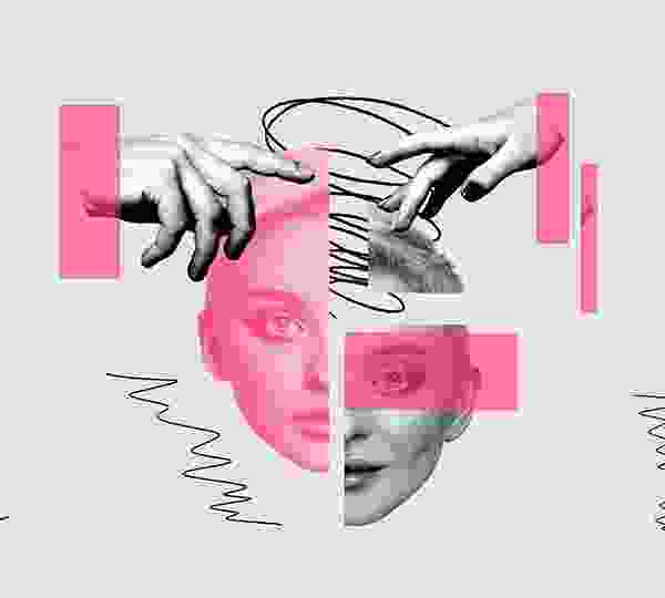
Colors have the unique ability to communicate feelings without words. Artists use hues to express joy, sadness, tension, or calm, allowing viewers to connect with a piece on a deeply emotional level. Reds, oranges, and yellows often evoke warmth, excitement, and passion. These colors can energize a composition, drawing attention and eliciting strong emotional responses from the audience.
Blues, greens, and purples tend to create a sense of serenity and relaxation. Cool tones often evoke introspection, peacefulness, and balance, guiding the viewer into a contemplative state. Combining warm and cool colors, or using high contrast, can heighten emotional impact. The interplay of light and dark, vibrant and muted tones, helps convey complexity and depth in the artist’s message. Color perception is influenced by culture, experience, and personal context. For example, white may adding layers of meaning to the emotional expression in art.
Color affects human psychology, influencing mood and perception. Artists leverage this by choosing specific palettes to evoke particular emotional reactions, guiding the viewer’s experience intentionally and subtly. Ultimately, the thoughtful use of color transforms art from mere visuals into emotional experiences. Through hues, tones, and contrasts, artists can evoke empathy, inspire reflection.
Comments ( 1 )
This post beautifully explains how colors can influence our emotions—truly enlightening!


This post beautifully explains how colors can influence our emotions—truly enlightening!